Creating Beauty from Ordinary Objects and Ugly Reference Photos
It is possible make a successful painting of almost any subject. Even a painting of a roll of paper towels can be made with beautiful artistic strokes and with a strong and interesting underlying composition. When you are painting something that is not inherently beautiful, like a roll of paper towels, you know right away that you are going to have to dig deep in your bag of design tricks to make a beautiful painting. But what happens when you have a beautiful reference photo? Easy, peasy, right? Not necessarily...
It might surprise you to know that having a beautiful reference photo actually can make for a much harder time painting. And why is that? Because it may not even occur to you how many things in a beautiful photo just won't translate well to a painting. One of my artist friends from my mom's painting group. John Stanford, paints the most beautiful landscapes, but his reference photos, in his own words, are the ugliest photos. Learning to copy what you see in a reference photo is a valuable technical skill. But I find that is it much more interesting to use the reference photo as a rough guide only. Instead, I find that using my technical design skills and knowledge to design a painting is a much more interesting process, and results in a painting that is much more expressive than one that is a more direct copy of the reference photo.
The skills needed to design a painting, rather than copying a photo, are developed by learning and practicing the generally accepted design fundamentals. This next section takes you through the basic process you can use to design your painting.
The Design Process Basics
Whenever you are painting a landscape, cityscape, or even a still life, pick one to three "main elements." The most important of these should be your primary focal point, both in placement and in how it is painted. The other two are sub-focal points and should be placed and painted accordingly. Everything else in your painting should support these three main elements. Anything that doesn't support the main "characters" should be removed or diminished in some way. (Sometimes this happens by making another element pop, so it is “diminished” in relation to the elements with more emphasis.)
Whenever you are using a reference photo, the first thing to do is to plan your composition (see note 2), keeping in mind that you want to simplify as much as possible at this stage, i.e. group together elements, leave out elements, etc. Do 3 - 5 (or more) thumbnail sketches, about 2"x3" each, in your sketchbook using a sharpie to determine placement of these 3 elements. (Refer to the "rule of thirds" for placement guidance.) Arrange the other large value shapes in your thumbnail sketches as well. Do not sketch any small shapes or details.
Pick your favorite thumbnail sketch and turn it into a larger (fill most of the page) value sketch. Do not add any additional details. Instead, shade in 3 - 5 distinct values. For 3 values, leave the lightest areas white, shade the medium values with charcoal, and shade in the darkest values with your sharpie or black paint. CRITIQUE YOUR DESIGN before moving forward!!! It is much easier to make big composition changes at this point!!!
Once you have a value sketch that works, use this to transfer your image to the canvas. You can freehand it, or use the grid method. AGAIN, DON'T ADD ANY DETAILS YET!!! Fill all your shapes with 3 to 5 distinct values. For 3 values, use:
- a very light tint that is close to white, but not pure white,
- a middle grey (50% black, 50% white), or any colorful gray that is around a value of 5
- and a really dark shade that is close to black, but not pure black.
If you need to use 5 values to keep from losing parts of your sketch, make sure each of the five values are distinct:
1) almost white,
2) 75%white mixed with 25% black,
3) 50/50 mix of black and white,
4) 75% black mixed with 25% white
5) almost black.
After filling in your value shapes, STEP BACK AND CRITIQUE AGAIN!!!!
I highly recommend that you don't start with color and details until you feel you have a strong and interesting underlying composition. Composition can be defined as the arrangement of your value shapes. One example guideline for a successful composition is to have small and interesting high contrast value shapes in your focal ares(s) surrounded by larger value shapes/masses elsewhere.
IF SOMETHING NEEDS TO BE MOVED/RESIZED/CHANGED, DO THAT NOW!!!
Some Examples
In separate blog posts I have several examples of where I have used design principles to help students improve their paintings. Some of the before and after photos are shown here for demonstration purposes. See the full review by clicking on the title above each set of images.
The Donkeys of Greece
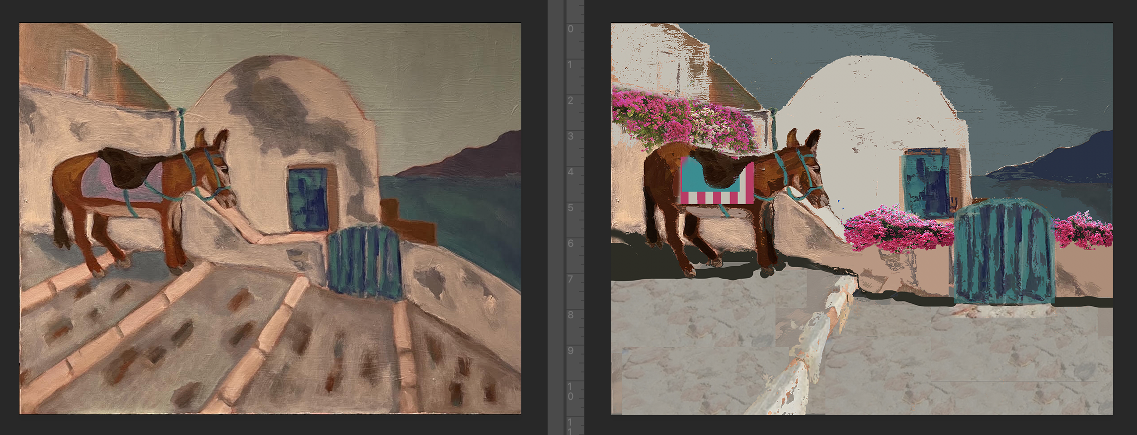
...This is a draft blog post. Check back later for more examples...